How to Change Your Site Name and Favicon in Mobile SERP
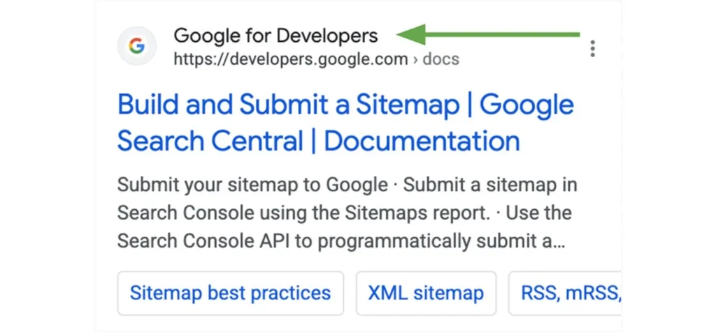
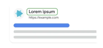
In the ever-evolving digital world, ensuring your website stands out in mobile search results is essential. With the increasing number of mobile internet users, optimizing how your website appears in mobile search engine results pages (SERPs) is more important than ever. Two key elements that contribute to this visibility are your site name and favicon. These elements are often the first things users see when browsing search results, and they play a crucial role in attracting clicks.
In this blog, we will guide you through the process of modifying your site name and favicon in mobile SERPs, providing you with the right code and tips to make your website more appealing to mobile users.
Why the Site Name and Favicon Matter for Mobile SERPs
Before jumping into the technical aspects, it’s essential to understand why having an optimized site name and favicon matters in mobile SERPs:
- Brand Identity: A clear and consistent site name and favicon help create a strong brand presence. When users can easily recognize your website, it increases trust and encourages them to visit your site.
- Improved User Experience: Having a recognizable favicon and a meaningful site name in the search results enhances the overall user experience. It reassures visitors that they are clicking on a reliable, professional website.
- Higher Click-Through Rates (CTR): An appealing favicon and a descriptive, memorable site name can encourage more clicks from users in mobile search results. Higher CTRs can, in turn, positively impact your website’s SEO performance.
- Mobile Optimization: With mobile-first indexing becoming more important for search engines like Google, ensuring that your site name and favicon display correctly on mobile devices is critical to your site’s performance in SERPs.
How to Change Your Site Name and Favicon for Mobile SERPs
1. Updating Your Site Name
The site name displayed in mobile SERPs is primarily derived from the <title> tag in your webpage’s HTML. This tag defines the title that appears in both browser tabs and search engine results. A good title is short, descriptive, and contains important keywords relevant to the content of your site.
Here’s an example of how to modify your site name in the <title> tag:
<!DOCTYPE html>
<html lang="en">
<head>
    <meta charset="UTF-8">
    <meta name="viewport" content="width=device-width, initial-scale=1.0">
    <title>My Awesome Blog - Tips, Tech, and Design | MySite.com</title>
    <meta name="description" content="Explore My Awesome Blog for insightful articles on technology, design, and more.">
</head>
<body>
    <h1>Welcome to My Awesome Blog!</h1>
</body>
</html>
Explanation:
<title>: This is where you set the name of your site that will appear in the browser tab and mobile search results. In this example, the site name is “My Awesome Blog – Tips, Tech, and Design”. Ensure that your title is under 60 characters to fit well on mobile screens.<meta name="description">: The description helps explain what your page is about. While it doesn’t directly influence your site name, a well-crafted description can increase your click-through rate in search results.
2. Updating Your Favicon
The favicon is a small, icon-like image displayed in the browser tab and mobile search results. It’s an essential part of your site’s branding and helps users identify your website quickly. To change your favicon, you’ll need to include the appropriate <link> tag in your HTML.
Here’s an example of how to update your favicon:
<!DOCTYPE html>
<html lang="en">
<head>
    <meta charset="UTF-8">
    <meta name="viewport" content="width=device-width, initial-scale=1.0">
    <title>My Awesome Blog - Tips, Tech, and Design | MySite.com</title>

    <!-- Favicon for mobile and desktop -->
    <link rel="icon" href="/path-to-your-favicon/favicon.ico" type="image/x-icon">
    <link rel="apple-touch-icon" href="/path-to-your-favicon/apple-icon.png">

    <meta name="description" content="Explore My Awesome Blog for insightful articles on technology, design, and more.">
</head>
<body>
    <h1>Welcome to My Awesome Blog!</h1>
</body>
</html>
Explanation:
<link rel="icon">: This tag defines the favicon to be shown in the browser tab and search results. Replace the URL inhrefwith the path to your favicon image.<link rel="apple-touch-icon">: This tag ensures that your favicon is displayed properly when users add your site to their home screen on iOS devices.

3. Defining Your Site Name with Structured Data
In addition to the <title> tag, you can use structured data (in JSON-LD format) to provide search engines with a clear understanding of your site’s name. This helps search engines like Google recognize and display your site more accurately in the SERPs.
Here’s how you can implement structured data to define your site name:
<script type="application/ld+json">
{
  "@context": "https://schema.org",
  "@type": "WebSite",
  "name": "My Awesome Blog",
  "url": "https://www.mysite.com/"
}
</script>
And, if you’re looking to add an alternative version for your site name to appear in the search results, you can add the following:
<script type="application/ld+json">
    {
      "@context" : "https://schema.org",
      "@type" : "WebSite",
      "name" : "Example Company",
      "alternateName" : "EC",
      "url" : "https://example.com/"
    }
  </script>
<script type="application/ld+json">
{
"@context": "https://schema.org",
"@type": "WebSite",
"name": "Burnt Toast",
"alternateName": ["BT", "B-T", "Burnt Toast Shop"],
"url": "https://www.example.com/"
}
</script>Explanation:
@context: This specifies that you’re using the Schema.org vocabulary.@type: The type is set toWebSite, indicating that this structured data is describing a website.name: This is the official name of your website, as you want it to appear in search results.url: The homepage URL of your website.
Using structured data helps search engines understand your website’s metadata and can improve how your site name is displayed in mobile search results.
Best Practices for Favicon Design
- Size and Resolution: Use multiple sizes for your favicon to ensure it looks good across all devices (e.g., 16×16 px, 32×32 px, 180×180 px for Apple devices).
- Simplicity: Your favicon should be simple and easily recognizable, even at small sizes. Focus on your logo or a recognizable symbol.
- Contrast: Choose high-contrast colors so that your favicon is clearly visible, even in low-light or dark mode.
Testing and Validation
Once you’ve updated your site name and favicon, it’s important to verify that the changes appear correctly in search results:
- Google’s Mobile-Friendly Test: Use Google’s Mobile-Friendly Test to ensure your site is optimized for mobile devices.
- Rich Results Test: Use Google’s Rich Results Test to check if your structured data is being recognized.
- Google Search Console: Use the URL Inspection Tool in Google Search Console to check if Google is indexing your page with the updated site name and favicon.
Conclusion
Optimizing your site name and favicon for mobile SERPs is a key part of enhancing your site’s appearance and usability in search results. By updating the <title> tag, adding a favicon, and incorporating structured data, you ensure that your site name is clear, recognizable, and professionally presented on mobile devices.
Remember, both the site name and favicon contribute to your website’s overall branding and user experience. With these changes, you can increase your chances of standing out in mobile search results, improving click-through rates, and ultimately boosting your website’s visibility and SEO performance.


